datetime, and matplotlib intro#
This lesson rounds out the introductory pandas work and introduces our basic plotting library matplotlib.
OBJECTIVES
Understand and use
datetimeobjects in pandas DataFramesUse
matplotlibto produce basic plots from dataUnderstand when to use histograms, boxplots, line plots, and scatterplots with data
import os
import numpy as np
import pandas as pd
import matplotlib.pyplot as plt
import seaborn as sns
datetime#
A special type of data for pandas are entities that can be considered as dates. We can create a special datatype for these using pd.to_datetime, and access the functions of the datetime module as a result.
# read in the AAPL data
url = 'https://raw.githubusercontent.com/jfkoehler/nyu_bootcamp_fa24/refs/heads/main/data/AAPL.csv'

#read_csv
#examine info
# convert to datetime
# extract the month
# extract the day
# set date to be index of data
# sort the index
#see if things have changed
aapl.info()
# select 2019
# read back in using parse_dates = True and index_col = 0
from datetime import datetime
# what time is it?
then = datetime.now()
then
# how much time has passed?
datetime.now() - then
More with timestamps#
Date times: A specific date and time with timezone support. Similar to datetime.datetime from the standard library.
Time deltas: An absolute time duration. Similar to datetime.timedelta from the standard library.
# create a pd.Timedelta
delta = pd.Timedelta('1W')
# shift a date by 3 months
datetime.now() + delta
Problems#
ufo_url = 'https://raw.githubusercontent.com/jfkoehler/nyu_bootcamp_fa24/refs/heads/main/data/ufo.csv'
Return to the ufo data and convert the Time column to a datetime object.
Set the Time column as the index column of the data.
Sort it
Create a new dataframe with ufo sightings since January 1, 1999
Grouping with Dates#
An operation similar to that of the groupby function can be used with dataframes whose index is a datetime object. This is the resample function, and the groups are essentially a time period like week, month, year, etc.
dow = sns.load_dataset('dowjones')
#check the info
dow.info()
#handle the index
dow.set_index('Date', inplace = True)
#check that things changed
dow.info()
dow.head()
#average yearly price
#quarterly maximum price
dow.resample('Q').max()
Introduction to matplotlib#
Now, let us turn our attention to plotting data. We begin with basic plots, and later explore some customization and additional plots. For these exercises, we will use the stock price data and a dataset about antarctic penguins from the seaborn library.
import seaborn as sns
import matplotlib.pyplot as plt
penguins = sns.load_dataset('penguins')
Line Plots with Matplotlib#
To begin, select the bill_length_mm column of the data.
penguins.info()
### bill length
bill_length = penguins['bill_length_mm']
### plt.plot
### use the series
#plot dow jones Price with matplotlib
#plot dow jones data from series
Choosing A Plot#
Below, plots are shown first for single quantiative variables, then single categorical variables. Next, two continuous variables, one continuous vs. one categorical, and any mix of continuous and categorical.
Histogram#
A histogram is an approximate representation of the distribution of numerical data. This is a plot we use for any single continuous feature to better understand the shape of the data.
### bill length histogram
plt.hist(bill_length)
### as a method with the series
bill_length.hist()
### adjusting the bin number
plt.hist(bill_length, bins = 100);
### adding a title, labels, edgecolor, and alpha
plt.hist(bill_length,
         edgecolor = 'black',
         color = 'red',
         alpha = 0.3)
plt.title('Bill Length (mm)');
penguins.hist();
Boxplot#
Similar to a histogram, a boxplot can be used on a single quantitative feature.
### boxplot of bill length
plt.boxplot(bill_length);
### WHOOPS -- lets try this without null values
plt.boxplot(bill_length.dropna());
### Make a horizontal version of the plot
plt.boxplot(bill_length.dropna(), vert = False);
Bar Plot#
A bar plot can be used to summarize a single categorical variable. For example, if you want the counts of each unique category in a categorical feature.
### counts of species
penguins['species'].value_counts()
### barplot of counts
penguins['species'].value_counts().plot(kind = 'bar')
Two Variable Plots#
penguins.head(2)
Scatterplot#
Two continuous features can be compared using scatterplots. Typically, one is interested in if a relationship between the features exists and the strength and direction of many datasets.
### bill length vs. bill depth
x = bill_length
y = penguins['bill_depth_mm']
### scatterplot of x vs. y
plt.scatter(x, y)
pandas.plotting#
There is not a quick easy plot in matplotlib to compare all numeric features in a dataset. Instead, pandas.plotting has a scatter_matrix function that serves a similar purpose.
from pandas.plotting import scatter_matrix
### scatter matrix of penguin data
scatter_matrix(penguins);
### adding arguments and changing size
scatter_matrix(penguins, diagonal = 'kde', figsize = (10, 10));
PROBLEMS
iris = sns.load_dataset('iris')
iris.head(2)
Problem 1: Histogram of petal_length
Problem 2: Scatter plot of sepal_length vs. sepal_width.
Problem 3: New column where
setosa -> blue
virginica -> green
versicolor -> orange
iris['colors'] = iris['species'].replace({'setosa': 'blue', 'virginica': 'green', 'versicolor': 'orange'})
Problem 4: Scatterplot of sepal_length vs petal_length colored by species.
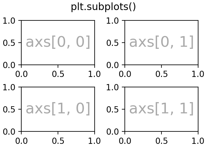
Subplots and Axes#
### create a 1 row 2 column plot
### add a plot to each axis
fig, ax = plt.subplots(1, 2)
### create a 2 x 2 grid of plots
### add histogram to bottom right plot
fig, ax = plt.subplots(2, 2, figsize = (10, 8))
Summary#
Great job! We will get practice plotting in this weeks homework and examine some other libraries and approaches during class next week. For now, make sure you are familiar with the basic plots above – histogram, boxplot, bar plot, scatterplot – and when to use each.