Homework 3: Advanced Pandas and Introductory Plotting#
import pandas as pd
import matplotlib.pyplot as plt
import numpy as np
import seaborn as sns
Problem 1: Loading a data file.
Below, load in the data from the spotify.csv file. Assign it to a variable spotify below.
spotify_url = 'https://raw.githubusercontent.com/jfkoehler/nyu_bootcamp_fa25/refs/heads/main/data/spotify.csv'
Problem 2: Who is the most frequently occurring artist in the data?
Problem 3: Using matplotlib create a histogram for the tempo column.
Problem 4: Using matplotlib create a scatterplot of tempo vs. danceability. Do these features seem related?
Problem 5: Load in the cell_phone_churn.csv data and assign as churn below.
This dataset contains customer information from a telecommunications company about customer churn. A customer is churned if they leave the provider.
churn_url = 'https://raw.githubusercontent.com/jfkoehler/nyu_bootcamp_fa25/refs/heads/main/data/cell_phone_churn.csv'
Problem 6: What percentage of customers were churned?
Problem 7: How do customers who have a voicemail plan and those who did not compare in terms of percent churned?
Problem 8: Using seaborn draw a barplot to represent the number of customers by the number of customer service calls these customers made.
Problem 9: Using seaborn draw boxplots for international minutes by customers who were churned and those that were not. Are there any differences between these groups?
Problem 10: Load in the gapminder_all.csv file and assign as gapminder_df below. This data comes from the Gapminder organization and contains information on countries GDP and Life Expectancy.
gapminder_url = 'https://raw.githubusercontent.com/jfkoehler/nyu_bootcamp_fa25/refs/heads/main/data/gapminder_all.csv'
Problem 11: What is the average GDP in 2007 for each continent?
Problem 12: Use seaborn to create a scatter plot for GDP vs. Life Expectancy for the data in 2007. Include a title and x and y labels. Adjust the size of the points using the population feature and color the points based on the continent.
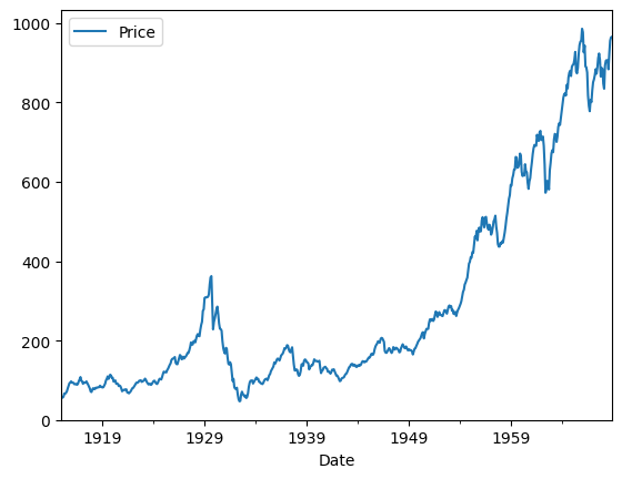
Problem 13: Read through Wilke’s chapter on Visualizing Trends here. Explore the .rolling method of a pandas.DataFrame and use it to produce a “smoothed” version of a time series plot. Draw two plots using the subplots function from matplotlib and display one plot with the original series and the second of the “smoothed” series.
dow = sns.load_dataset('dowjones').set_index('Date')
dow.rolling(window = 1).mean().plot();
PROBLEM 14 Read through Wilke’s chapter A Directory of Visualizations here. Identify a plot that you haven’t built yet and use seaborn to demonstrate its implementation and explain its interpretation. Use one of the built in seaborn datasets to construct your visualization.
BONUSes
Feel free to complete any one, two, or all of these problems. If the above problems took you a long time please don’t drive yourself crazy trying to do anything. These problems are not simple, and you should write clear, commented code that is not the result of an LLM. Use the documentation, run code, read error messages, take a walk, ask questions in office hours. This should be kind of fun…
Head over to the documentation for ipywidgets here. Use the library to build an interactive visualization of a time series dataset that uses a slider to control a smoothing window. Add a title “dataset name rolling mean for {size of window} time steps”.
Checkout the notebook introducing the bokeh plotting library here. Also, consult the documentation here. Use the library to build an interactive visualization of a dataset of your choosing. Do this in a separate notebook and use markdown cells to build a brief tutorial on how to build your selected visualization. To get credit for this problem you should submit a link to a standalone colab notebook visible to “anyone with the link” here along with a one paragraph summary of the visualization that will be shared with the class through our github repository and book. Be prepared to discuss your visualization and bokeh functionality that was crucial to its construction in 30 - 60 seconds.
Read over the Code Magazine article Building dashboards with Python here. Focus on using the bokeh serve --show function to launch a bokeh plot code file containing a basic or complex bokeh dashboard with a data table and interactive plot. Make sure your code is well commented, write a one paragraph description of your work and submit that here along with the .py file of your plot. Be prepared to discuss your visualization and bokeh functionality that was crucial to its construction in 30 - 60 seconds.