Regression Part II#
OBJECTIVES
Use
sklearnto build multiple regression modelsUse
statsmodelsto build multiple regression modelsEvaluate models using
mean_squared_errorInterpret categorical coefficients
import matplotlib.pyplot as plt
import numpy as np
import pandas as pd
import seaborn as sns

from sklearn.linear_model import LinearRegression
from sklearn.metrics import mean_squared_error
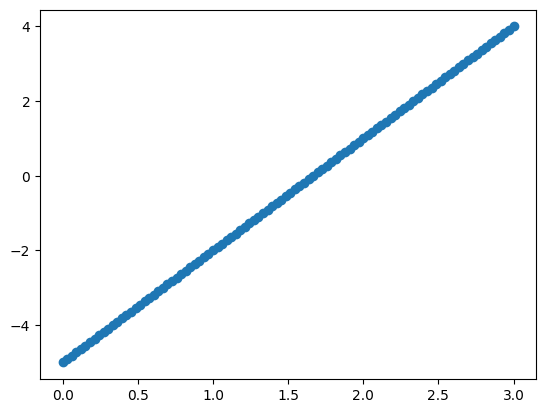
x = np.linspace(0, 3, 100)
def f(x): return 3*x - 5
plt.scatter(x, f(x))
plt.savefig('aplot.png')
Using Many Features#
The big idea with a regression model is its ability to learn parameters of linear equations.
tips = sns.load_dataset('tips')
X = tips['total_bill'].values.reshape(-1, 1)
y = tips['tip'].values.reshape(-1, 1)
#column of ones for intercept
intercept = np.ones(shape = X.shape)
#design matrix contains leading column of ones
design_matrix = np.concatenate((intercept, X), axis = 1)
design_matrix[:5]
array([[ 1.  , 16.99],
       [ 1.  , 10.34],
       [ 1.  , 21.01],
       [ 1.  , 23.68],
       [ 1.  , 24.59]])
#linear algebra solution to least squares
np.linalg.inv(design_matrix.T@design_matrix)@design_matrix.T@y
array([[0.92026961],
       [0.10502452]])
Advertising Data#
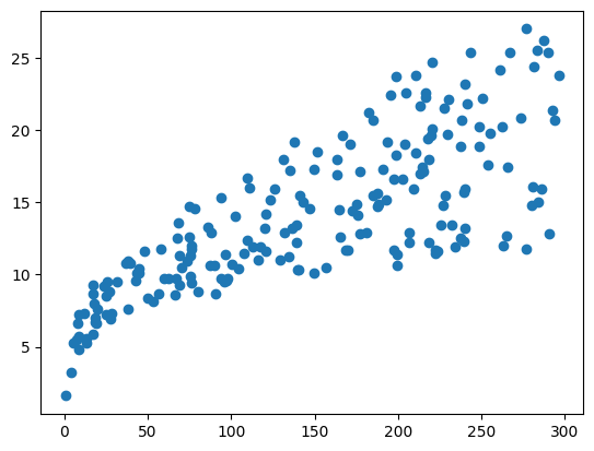
The goal here is to predict sales. We have spending on three different media types to help make such predictions. Here, we want to be selective about what features are used as inputs to the model.
ads = pd.read_csv('https://raw.githubusercontent.com/jfkoehler/nyu_bootcamp_fa25/main/data/ads.csv', index_col=0)
ads.head()
| TV | radio | newspaper | sales | |
|---|---|---|---|---|
| 1 | 230.1 | 37.8 | 69.2 | 22.1 |
| 2 | 44.5 | 39.3 | 45.1 | 10.4 |
| 3 | 17.2 | 45.9 | 69.3 | 9.3 |
| 4 | 151.5 | 41.3 | 58.5 | 18.5 |
| 5 | 180.8 | 10.8 | 58.4 | 12.9 |
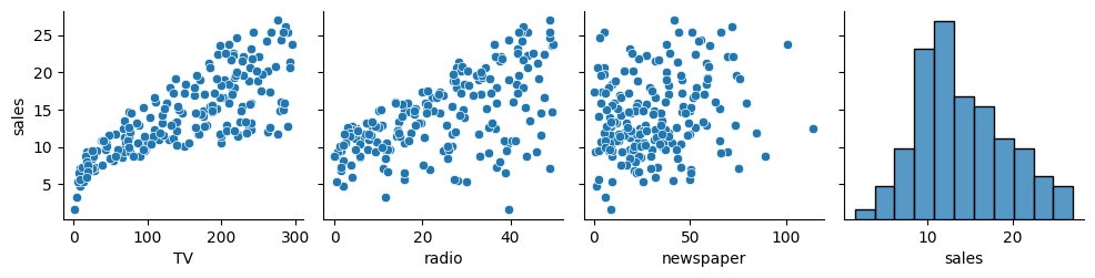
#scatterplot
plt.scatter(ads['TV'], ads['sales']);
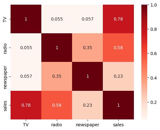
# heatmap
sns.heatmap(ads.corr(), annot = True, cmap = 'Reds');
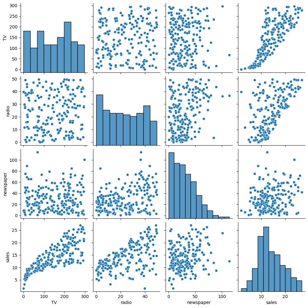
# pairplot
sns.pairplot(ads);
Choose a single column as
Xto predict sales. Justify your choice – remember to makeX2D.
#declare X and y
X = ads[['TV']]
y = ads['sales']
Build a regression model to predict
salesusing yourXabove.
# instantiate and fit the model
model1 = LinearRegression().fit(X, y)
Interpret the slope of the model.
# examine slope, what does it mean?
model1.coef_
array([0.04753664])
Interpret the intercept of the model.
#intercept
model1.intercept_
7.032593549127695
Determine the
mean_squared_errorof the model.
from sklearn.metrics import mean_squared_error
# MSE
yhat = model1.predict(X)
mean_squared_error(y, yhat)
10.512652915656757
Create baseline predictions using the mean of
y. (Try theDummyRegressorhere).
from sklearn.dummy import DummyRegressor
dummy = DummyRegressor().fit(X, y)
X.head(3)
| TV | |
|---|---|
| 1 | 230.1 |
| 2 | 44.5 |
| 3 | 17.2 |
yhat_base = dummy.predict(X)
Compute the
mean_squared_errorof your baseline predictions.
# MSE Baseline
mean_squared_error(y, yhat_base)
27.085743750000002
Did your model perform better than the baseline?
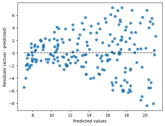
What does the
PredictionErrorDisplayobject do? Can you demonstrate its use?
from sklearn.metrics import PredictionErrorDisplay
PredictionErrorDisplay?
Init signature: PredictionErrorDisplay(*, y_true, y_pred)
Docstring:
Visualization of the prediction error of a regression model.

This tool can display "residuals vs predicted" or "actual vs predicted"
using scatter plots to qualitatively assess the behavior of a regressor,
preferably on held-out data points.

See the details in the docstrings of
:func:`~sklearn.metrics.PredictionErrorDisplay.from_estimator` or
:func:`~sklearn.metrics.PredictionErrorDisplay.from_predictions` to
create a visualizer. All parameters are stored as attributes.

For general information regarding `scikit-learn` visualization tools, read
more in the :ref:`Visualization Guide <visualizations>`.
For details regarding interpreting these plots, refer to the
:ref:`Model Evaluation Guide <visualization_regression_evaluation>`.

.. versionadded:: 1.2

Parameters
----------
y_true : ndarray of shape (n_samples,)
    True values.

y_pred : ndarray of shape (n_samples,)
    Prediction values.

Attributes
----------
line_ : matplotlib Artist
    Optimal line representing `y_true == y_pred`. Therefore, it is a
    diagonal line for `kind="predictions"` and a horizontal line for
    `kind="residuals"`.

errors_lines_ : matplotlib Artist or None
    Residual lines. If `with_errors=False`, then it is set to `None`.

scatter_ : matplotlib Artist
    Scatter data points.

ax_ : matplotlib Axes
    Axes with the different matplotlib axis.

figure_ : matplotlib Figure
    Figure containing the scatter and lines.

See Also
--------
PredictionErrorDisplay.from_estimator : Prediction error visualization
    given an estimator and some data.
PredictionErrorDisplay.from_predictions : Prediction error visualization
    given the true and predicted targets.

Examples
--------
>>> import matplotlib.pyplot as plt
>>> from sklearn.datasets import load_diabetes
>>> from sklearn.linear_model import Ridge
>>> from sklearn.metrics import PredictionErrorDisplay
>>> X, y = load_diabetes(return_X_y=True)
>>> ridge = Ridge().fit(X, y)
>>> y_pred = ridge.predict(X)
>>> display = PredictionErrorDisplay(y_true=y, y_pred=y_pred)
>>> display.plot()
<...>
>>> plt.show()
File:           /Library/Frameworks/Python.framework/Versions/3.12/lib/python3.12/site-packages/sklearn/metrics/_plot/regression.py
Type:           type
Subclasses:
display = PredictionErrorDisplay(y_true = y, y_pred = yhat)
display.plot()
<sklearn.metrics._plot.regression.PredictionErrorDisplay at 0x13ded59a0>
the .score method#
In addition to the mean_squared_error function, you are able to evaluate regression models using the objects .score method. This method evaluates in terms of \(r^2\). One way to understand this metric is as the ratio between the residual sum of squares and the total sum of squares. These are given by:
and
#model score
model1.score(X, y)
0.611875050850071
You can interpret this as the percent of variation in the data explained by the features according to your model.
Adding Features#
Now, we want to include a second feature as input to the model. Reexamine the plots and correlations above, what is a good second choice?
Choose two columns from the
adsdata, assign these asX.
sns.pairplot(ads, y_vars = 'sales')
<seaborn.axisgrid.PairGrid at 0x13b68f980>
# X2
X2 = ads[['TV', 'radio', 'newspaper']]
Build a regression model with two features to predict
sales.
# lr2 model
lr2 = LinearRegression().fit(X2, y)
Evaluate the model using
mean_squared_error.
# yhat2
yhat2 = lr2.predict(X2)
# MSE
mean_squared_error(y, yhat2)
2.784126314510936
lr2.score(X2, y)
0.8972106381789522
Interpret the coefficients of the model
# make a dataframe here
pd.DataFrame(lr2.coef_, index = ['TV', 'radio'])
| 0 | |
|---|---|
| TV | 0.045755 |
| radio | 0.187994 |
Example II: California Housing Data#
cali = pd.read_csv('https://raw.githubusercontent.com/ageron/data/refs/heads/main/housing/housing.csv')
cali.head()
| longitude | latitude | housing_median_age | total_rooms | total_bedrooms | population | households | median_income | median_house_value | ocean_proximity | |
|---|---|---|---|---|---|---|---|---|---|---|
| 0 | -122.23 | 37.88 | 41.0 | 880.0 | 129.0 | 322.0 | 126.0 | 8.3252 | 452600.0 | NEAR BAY |
| 1 | -122.22 | 37.86 | 21.0 | 7099.0 | 1106.0 | 2401.0 | 1138.0 | 8.3014 | 358500.0 | NEAR BAY |
| 2 | -122.24 | 37.85 | 52.0 | 1467.0 | 190.0 | 496.0 | 177.0 | 7.2574 | 352100.0 | NEAR BAY |
| 3 | -122.25 | 37.85 | 52.0 | 1274.0 | 235.0 | 558.0 | 219.0 | 5.6431 | 341300.0 | NEAR BAY |
| 4 | -122.25 | 37.85 | 52.0 | 1627.0 | 280.0 | 565.0 | 259.0 | 3.8462 | 342200.0 | NEAR BAY |
# !pip install folium
import folium
from folium.plugins import HeatMap
m = folium.Map(cali[['latitude', 'longitude']].values[0])
HeatMap(cali[['latitude', 'longitude', 'median_house_value']].values, blur = 1, radius = 5).add_to(m);
m
#what features do you think matter?
#any new features we can manufacture?
#any features to encode?
#any missing data?