More plotting with matplotlib and seaborn#
Today we continue to work with matplotlib, focusing on customization and using subplots. Also, the seaborn library will be introduced as a second visualization library with additional functionality for plotting data.
#!pip install -U seaborn
import os
import numpy as np
import pandas as pd
import matplotlib.pyplot as plt
import seaborn as sns
---------------------------------------------------------------------------
ModuleNotFoundError                       Traceback (most recent call last)
Cell In[2], line 5
      3 import pandas as pd
      4 import matplotlib.pyplot as plt
----> 5 import seaborn as sns

ModuleNotFoundError: No module named 'seaborn'
3D Plotting#
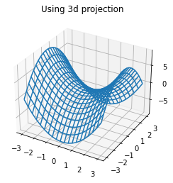
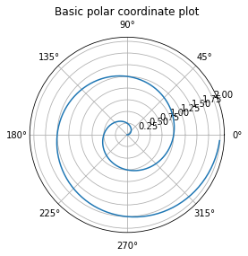
There are additional projections available including polar and three dimensional projections. These can be accessed through the projection argument in the axes functions.
def f(x, y):
    return x**2 - y**2
x = np.linspace(-3, 3, 20)
y = np.linspace(-3, 3, 20)
X, Y = np.meshgrid(x, y)
ax = plt.axes(projection = '3d')
ax.plot_wireframe(X, Y, f(X, Y))
ax.set_title('Using 3d projection');
r = np.arange(0, 2, 0.01)
theta = 2 * np.pi * r
ax = plt.axes(projection = 'polar')
ax.plot(theta, r)
ax.set_title('Basic polar coordinate plot');
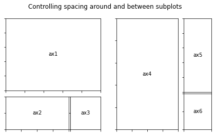
Gridspec#
If you want to change the layout and organization of the subplot the Gridspec object allows you to specify additional information about width and height ratios of the subplots. Examples below are from the documentation here.
from matplotlib.gridspec import GridSpec
#helper for annotating
def annotate_axes(fig):
    for i, ax in enumerate(fig.axes):
        ax.text(0.5, 0.5, "ax%d" % (i+1), va="center", ha="center")
        ax.tick_params(labelbottom=False, labelleft=False)
fig = plt.figure()
fig.suptitle("Controlling subplot sizes with width_ratios and height_ratios")

gs = GridSpec(2, 2, width_ratios=[1, 2], height_ratios=[4, 1])
ax1 = fig.add_subplot(gs[0])
ax2 = fig.add_subplot(gs[1])
ax3 = fig.add_subplot(gs[2])
ax4 = fig.add_subplot(gs[3])

annotate_axes(fig)
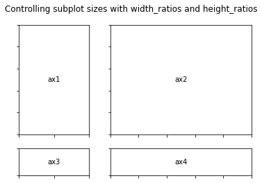
fig = plt.figure()
fig.suptitle("Controlling spacing around and between subplots")

gs1 = GridSpec(3, 3, left=0.05, right=0.48, wspace=0.05)
ax1 = fig.add_subplot(gs1[:-1, :])
ax2 = fig.add_subplot(gs1[-1, :-1])
ax3 = fig.add_subplot(gs1[-1, -1])

gs2 = GridSpec(3, 3, left=0.55, right=0.98, hspace=0.05)
ax4 = fig.add_subplot(gs2[:, :-1])
ax5 = fig.add_subplot(gs2[:-1, -1])
ax6 = fig.add_subplot(gs2[-1, -1])

annotate_axes(fig)

plt.show()
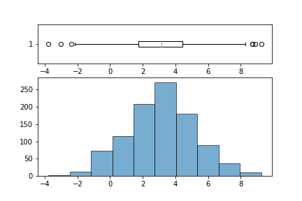
Exercise#
Use GridSpec to write a function that takes in a column from a DataFrame (a Series object) and returns a 2 row 1 column plot where the bottom plot is a histogram and top is boxplot; similar to image below.
Introduction to seaborn#
The seaborn library is built on top of matplotlib and offers high level visualization tools for plotting data. Typically a call to the seaborn library looks like:
sns.plottype(data = DataFrame, x = x, y = y, additional arguments...)
### load a sample dataset on tips
tips = sns.load_dataset('tips')
tips.head(2)
| total_bill | tip | sex | smoker | day | time | size | |
|---|---|---|---|---|---|---|---|
| 0 | 16.99 | 1.01 | Female | No | Sun | Dinner | 2 |
| 1 | 10.34 | 1.66 | Male | No | Sun | Dinner | 3 |
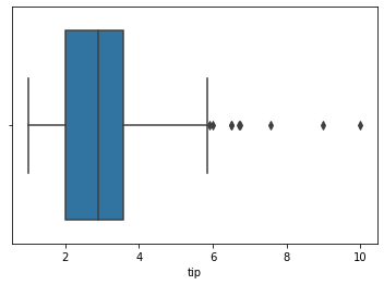
### boxplot of tips
sns.boxplot(data = tips, x = 'tip')
<AxesSubplot: xlabel='tip'>
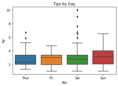
### boxplot of tips by day
sns.boxplot(data = tips, x = 'day', y = 'tip')
plt.title('Tips by Day');
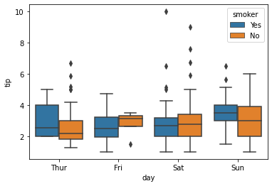
hue#
The hue argument works like a grouping helper with seaborn. Plots that have this argument will break the data into groups from the passed column and add an appropriate legend.
### boxplot of tips by day by smoker
sns.boxplot(data = tips, x = 'day', y = 'tip', hue = 'smoker')
<AxesSubplot: xlabel='day', ylabel='tip'>
displot#
For visualizing one dimensional distributions of data.
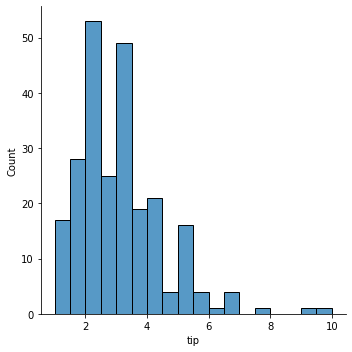
### histogram of tips
sns.displot(data = tips, x = 'tip')
<seaborn.axisgrid.FacetGrid at 0x7faa09939fa0>
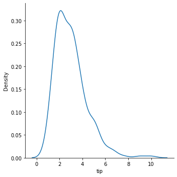
### kde plot
sns.displot(data = tips, x = 'tip', kind = 'kde')
<seaborn.axisgrid.FacetGrid at 0x7faa09bb3220>
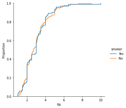
### empirical cumulative distribution plot of tips by smoker
sns.displot(data = tips, x = 'tip', kind = 'ecdf', hue = 'smoker')
<seaborn.axisgrid.FacetGrid at 0x7faa0a07ae20>
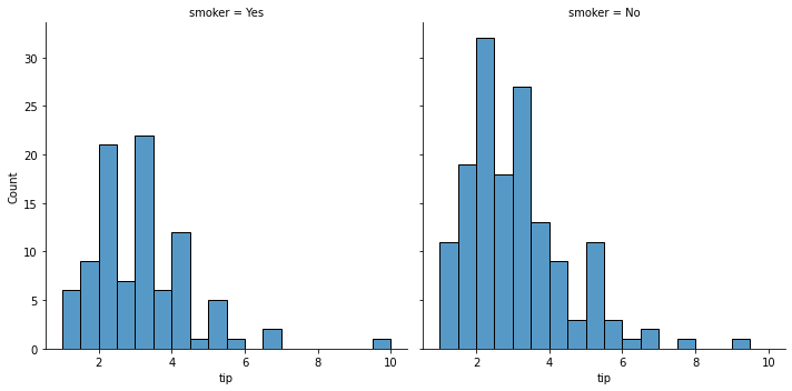
### using the col argument
sns.displot(data = tips, x = 'tip', col = 'smoker')
<seaborn.axisgrid.FacetGrid at 0x7faa09e07340>
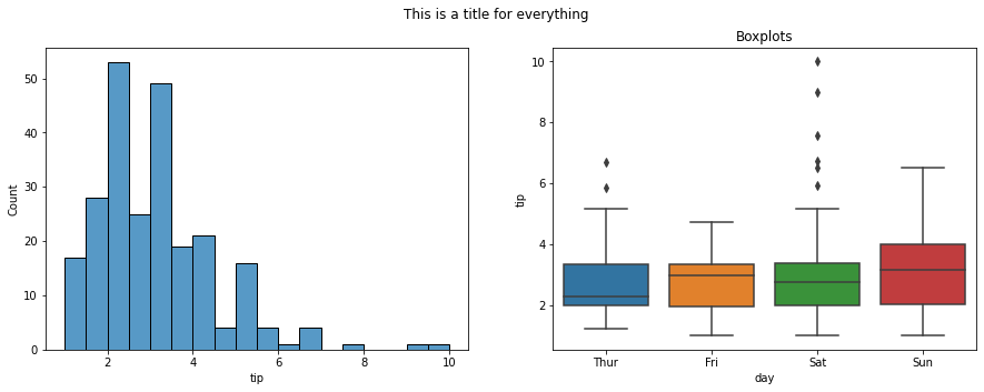
#draw a histogram and a boxplot using seaborn on two axes
fig, ax = plt.subplots(1, 2, figsize = (15, 5))
sns.histplot(data = tips, x = 'tip', ax = ax[0])
sns.boxplot(data = tips, x = 'day', y = 'tip', ax = ax[1])
ax[1].set_title('Boxplots')
fig.suptitle('This is a title for everything');
relplot#
For visualizing relationships.
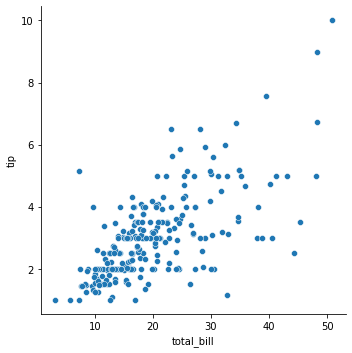
### relplot of bill vs. tip
sns.relplot(data = tips, x = 'total_bill', y = 'tip')
<seaborn.axisgrid.FacetGrid at 0x7faa0a92a700>
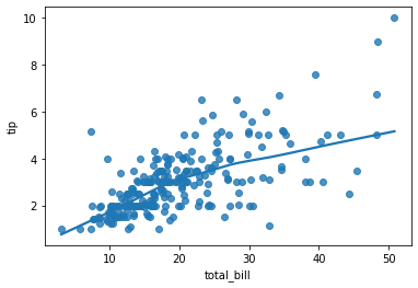
### regression plot
sns.regplot(data = tips, x ='total_bill', y = 'tip', lowess = True )
<AxesSubplot: xlabel='total_bill', ylabel='tip'>
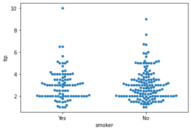
### swarm
sns.swarmplot(data = tips, x = 'smoker', y = 'tip')
<AxesSubplot: xlabel='smoker', ylabel='tip'>
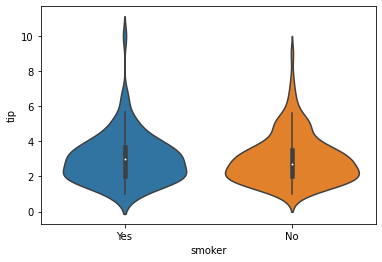
### violin plot
sns.violinplot(data = tips, x = 'smoker', y = 'tip')
<AxesSubplot: xlabel='smoker', ylabel='tip'>
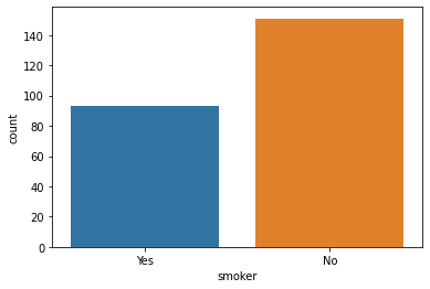
### countplot
sns.countplot(data = tips, x = 'smoker');
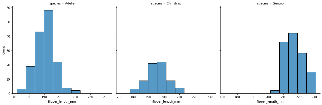
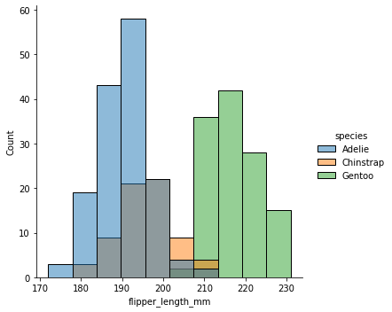
Create a histogram of flipper length by species.
penguins = sns.load_dataset('penguins')
penguins.head()
| species | island | bill_length_mm | bill_depth_mm | flipper_length_mm | body_mass_g | sex | |
|---|---|---|---|---|---|---|---|
| 0 | Adelie | Torgersen | 39.1 | 18.7 | 181.0 | 3750.0 | Male |
| 1 | Adelie | Torgersen | 39.5 | 17.4 | 186.0 | 3800.0 | Female |
| 2 | Adelie | Torgersen | 40.3 | 18.0 | 195.0 | 3250.0 | Female |
| 3 | Adelie | Torgersen | NaN | NaN | NaN | NaN | NaN |
| 4 | Adelie | Torgersen | 36.7 | 19.3 | 193.0 | 3450.0 | Female |
sns.displot(data = penguins, x = 'flipper_length_mm', col = 'species')
<seaborn.axisgrid.FacetGrid at 0x7faa0c1d0880>
sns.displot(data = penguins, x = 'flipper_length_mm', hue = 'species')
<seaborn.axisgrid.FacetGrid at 0x7faa0c85bb80>
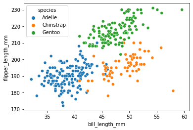
Create a scatterplot of bill length vs. flipper length.
sns.scatterplot(data = penguins, x = 'bill_length_mm', y = 'flipper_length_mm', hue = 'species')
<AxesSubplot: xlabel='bill_length_mm', ylabel='flipper_length_mm'>
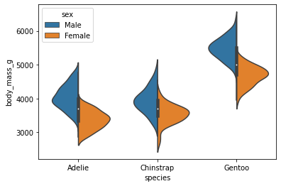
Create a violin plot of each species mass split by sex.
sns.violinplot(data = penguins, x = 'species', y = 'body_mass_g', hue = 'sex', split = True)
<AxesSubplot: xlabel='species', ylabel='body_mass_g'>
Additional Plots#
pairplotheatmap
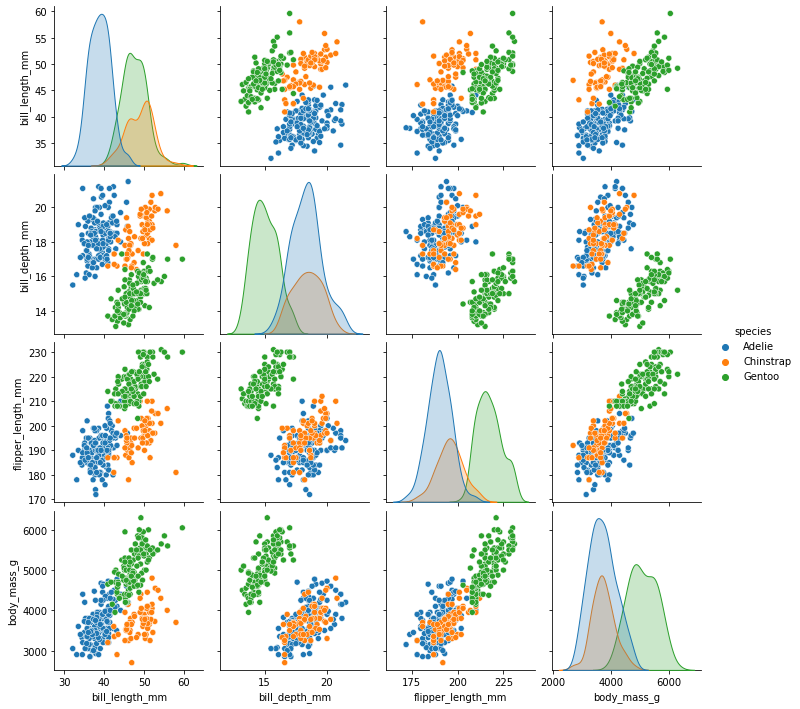
penguins = sns.load_dataset('penguins').dropna()
### pairplot of penguins colored by species
sns.pairplot(data = penguins, hue = 'species')
<seaborn.axisgrid.PairGrid at 0x7fa9ed579f40>
### housing data
from sklearn.datasets import fetch_california_housing
housing = fetch_california_housing(as_frame = True).frame
housing.head()
| MedInc | HouseAge | AveRooms | AveBedrms | Population | AveOccup | Latitude | Longitude | MedHouseVal | |
|---|---|---|---|---|---|---|---|---|---|
| 0 | 8.3252 | 41.0 | 6.984127 | 1.023810 | 322.0 | 2.555556 | 37.88 | -122.23 | 4.526 |
| 1 | 8.3014 | 21.0 | 6.238137 | 0.971880 | 2401.0 | 2.109842 | 37.86 | -122.22 | 3.585 |
| 2 | 7.2574 | 52.0 | 8.288136 | 1.073446 | 496.0 | 2.802260 | 37.85 | -122.24 | 3.521 |
| 3 | 5.6431 | 52.0 | 5.817352 | 1.073059 | 558.0 | 2.547945 | 37.85 | -122.25 | 3.413 |
| 4 | 3.8462 | 52.0 | 6.281853 | 1.081081 | 565.0 | 2.181467 | 37.85 | -122.25 | 3.422 |
Plotting Correlations#
Correlation captures the strength of a linear relationship between features. Often, this is easier to look at than a scatterplot of the data to establish relationships, however recall that this is only a detector for linear relationships!
### correlation in data
housing.corr(numeric_only = True)
| MedInc | HouseAge | AveRooms | AveBedrms | Population | AveOccup | Latitude | Longitude | MedHouseVal | |
|---|---|---|---|---|---|---|---|---|---|
| MedInc | 1.000000 | -0.119034 | 0.326895 | -0.062040 | 0.004834 | 0.018766 | -0.079809 | -0.015176 | 0.688075 |
| HouseAge | -0.119034 | 1.000000 | -0.153277 | -0.077747 | -0.296244 | 0.013191 | 0.011173 | -0.108197 | 0.105623 |
| AveRooms | 0.326895 | -0.153277 | 1.000000 | 0.847621 | -0.072213 | -0.004852 | 0.106389 | -0.027540 | 0.151948 |
| AveBedrms | -0.062040 | -0.077747 | 0.847621 | 1.000000 | -0.066197 | -0.006181 | 0.069721 | 0.013344 | -0.046701 |
| Population | 0.004834 | -0.296244 | -0.072213 | -0.066197 | 1.000000 | 0.069863 | -0.108785 | 0.099773 | -0.024650 |
| AveOccup | 0.018766 | 0.013191 | -0.004852 | -0.006181 | 0.069863 | 1.000000 | 0.002366 | 0.002476 | -0.023737 |
| Latitude | -0.079809 | 0.011173 | 0.106389 | 0.069721 | -0.108785 | 0.002366 | 1.000000 | -0.924664 | -0.144160 |
| Longitude | -0.015176 | -0.108197 | -0.027540 | 0.013344 | 0.099773 | 0.002476 | -0.924664 | 1.000000 | -0.045967 |
| MedHouseVal | 0.688075 | 0.105623 | 0.151948 | -0.046701 | -0.024650 | -0.023737 | -0.144160 | -0.045967 | 1.000000 |
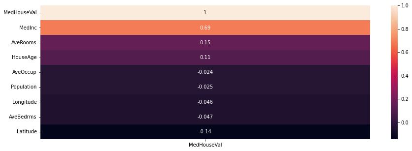
### heatmap of correlations
plt.figure(figsize = (15, 5))
sns.heatmap(housing.corr()[['MedHouseVal']].sort_values(by = 'MedHouseVal', ascending = False), annot = True)
<AxesSubplot: >
Problems#
Use the diabetes data below loaded from OpenML (docs).
from sklearn.datasets import fetch_openml
diabetes = fetch_openml(data_id = 37).frame
diabetes.head()
| preg | plas | pres | skin | insu | mass | pedi | age | class | |
|---|---|---|---|---|---|---|---|---|---|
| 0 | 6.0 | 148.0 | 72.0 | 35.0 | 0.0 | 33.6 | 0.627 | 50.0 | tested_positive |
| 1 | 1.0 | 85.0 | 66.0 | 29.0 | 0.0 | 26.6 | 0.351 | 31.0 | tested_negative |
| 2 | 8.0 | 183.0 | 64.0 | 0.0 | 0.0 | 23.3 | 0.672 | 32.0 | tested_positive |
| 3 | 1.0 | 89.0 | 66.0 | 23.0 | 94.0 | 28.1 | 0.167 | 21.0 | tested_negative |
| 4 | 0.0 | 137.0 | 40.0 | 35.0 | 168.0 | 43.1 | 2.288 | 33.0 | tested_positive |
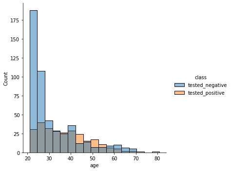
Distribution of ages separated by class.
sns.displot(diabetes, x = 'age', hue = 'class')
<seaborn.axisgrid.FacetGrid at 0x7fa9f0ae6b80>
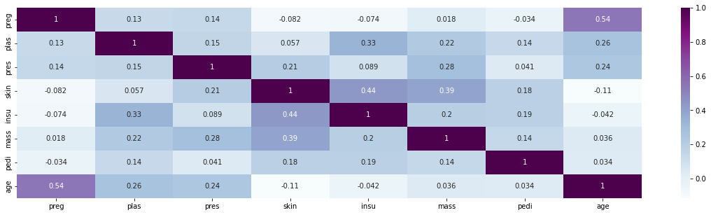
Heatmap of features. Any strong correlations?
plt.figure(figsize = (20, 5))
sns.heatmap(diabetes.corr(), annot = True, cmap = 'BuPu')
<ipython-input-58-7c98d612fac1>:2: FutureWarning: The default value of numeric_only in DataFrame.corr is deprecated. In a future version, it will default to False. Select only valid columns or specify the value of numeric_only to silence this warning.
  sns.heatmap(diabetes.corr(), annot = True, cmap = 'BuPu')
<AxesSubplot: >
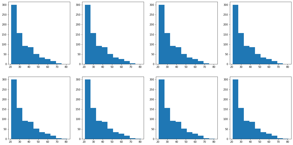
CHALLENGE: 2 rows and 4 columns with histograms separated by class column. Which feature has the most distinct difference between classes?
fig, ax = plt.subplots(2, 4, figsize = (20, 10))
for row in range(2):
    for col in range(4):
        ax[row, col].hist(diabetes['age'])
#
Review#
data = {'Food': ['French Fries', 'Potato Chips', 'Bacon', 'Pizza', 'Chili Dog'],
        'Calories per 100g':  [607, 542, 533, 296, 260]}
cals = pd.DataFrame(data)
EXERCISE
Set ‘Food’ as the index of cals.
Create a bar chart with calories.
Add a title.
Change the color of the bars.
Add the argument alpha=0.5. What does it do?
Change your chart to a horizontal bar chart. Which do you prefer?